Design of iPhone applications
Relevant resources
Documentation
Video - Apple resources
Video - Others
Web
Sample code - Apple
Emphasis on design
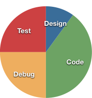
The typical development cycle of an application tends to be heavy on the technical elements:

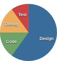
but Apple recommends a lot more emphasis be placed on the core design of an application:

Bugs in code can be fixed, but a poor design can condemn an entire application. Also, remember that the best code is the code you don't have to write.
Familiarize yourself with the iPhone
You are using a finger, not a mouse or stylus. The minimum touch area is 44 x 44 pixels, as measured by Apple. No touchable element should be smaller than that.
Text input should be minimized. Even though the iPhone has a very good software keyboard, it is still harder to input text on they device than on a laptop. Mobile applications need to allow for quick use, and text entry takes time. Remember text where possible, and use other interface elements to have users choose from lists when you can.
Apple suggests that there are three classes of iPhone applications:
Observe how other applications solve certain problems, particularly those that come with the iPhone. Also pay attention to how you and others use the device.
Application Definition Statement
To begin with, create a one-sentence Application Definition Statement. This will help you decide on which features to put in, and, more importantly, what features to leave out. This can also clarify and direct your marketing efforts after release.
Examples:
Brainstorm all of the features, large or small, that could be in this application. Cut out the ones that don't match your definition statement. Focus on the few that will be most frequently used, and that are most appropriate for an application on a mobile device.
Challenge yourself
When it comes to the scope of the application, challenge yourself. If the application can be written in fewer than two weeks, don't bother. Pretty much all of the low-hanging fruit has been picked in the App Store. More robust applications that take longer to build are much less vulnerable to knockoffs and free competitors.
“Make no little plans. They have no magic to stir men’s blood and probably themselves will not be realized. Make big plans; aim high in hope and work, remembering that a noble, logical diagram once recorded will never die, but long after we are gone will be a living thing, asserting itself with ever-growing insistency. Remember that our sons and grandsons are going to do things that would stagger us. Let your watchword be order and your beacon beauty. Think big.”
—DANIEL BURNHAM, CHICAGO ARCHITECT. (1864-1912) (via John Gruber)
Wireframe your application
Interface Builder is a great tool for laying out application interfaces that use standard interface elements. However, most polished iPhone applications have one or two custom elements in their interfaces.
Before you start writing code, it's recommended that you draw up a wireframe of each screen in your application. Even if you have a more traditional interface, it's also good to draw up the control flow.
There are several stencil sets for various drawing applications:
As well as for paper: http://blog.cocoia.com/2009/iphone-stencil-mini-review/, http://www.mobilesketchbook.com/
When you have your wireframe drawn up, take a look at using the Briefs framework to make an interactive mockup: http://giveabrief.com/ . By simply supplying images and a property list file, you can make an application that responds to touch in specific areas, like an old-style Hypercard stack. This lets you make a fully interactive prototype that will run on an actual device.
At any time in the design process, don't be afraid to hire a graphic designer. Programmers tend to be bad at interface and icon design.
Design an icon
Your icon is one of your most important sales tools. A terrible-looking icon can stop people from buying even the most polished application. Not only that, but your users will stare it it every day.
Whatever you do, do not crapify your icon with "Sale", "50% off", or other banners. They have no place there.
I highly recommend the Icon Resource videos for explaining the design of an icon.
For a drawing tool, it's hard to beat Opacity. Opacity has a template for iPhone icons, that can produce device-scale icons, as well as App-Store-sized versions. It also provides a real-time preview of the icon in the setting of a virtual home screen, as well as a mockup of the App Store.
For in-application toolbar and tab bar icons, Glyphish provides a set of Creative Commons licensed icons that you can use, as long as you give sufficient attribution.
User interface guidelines
Read the iPhone Human Interface Guidelines. Follow the conventions laid out there, unless you have a very good reason for not doing to.
Don't mess with the standard colors for alerts and buttons. Users have built expectations for how iPhone applications should behave, based on their experience with other applications. Many users take actions without even reading the text of buttons, relying on position and color to know what to press.
Don't cram too much onto the screen. A great example of the difference this makes is the early interface for TripLog / 1040 (a straight port from a Palm application):
http://www.flickr.com/photos/gruber/2635257578/
versus an application like Trip Cubby:
http://appcubby.com/trip/screenshots.html
Tapping should cause an immediate action. If you tap and it does something somewhere else on the screen, this abstraction causes stress for the user (potentially good for a game, bad for a productivity application).
When using a navigation controller, organize your view hierarchy in a way that matches the user's mental model. Start broad, and become more targeted with each level.
Use toolbars for frequently accessed operations and tab bars for switches of context.
Animations can guide the eye and direct the user. Core Animation is a huge part of the overall iPhone OS experience, giving it that smooth, accessible feel.
Polish your application by using it in the real world.
Finally, design with iPhone OS 3.x in mind, 2.x is no longer relevant:
http://metrics.admob.com/2009/12/updated-iphone-os-stats/